Friday, July 27, 2012

Video Text and Storyboarding

It took Microsoft Encoder, Microsoft Movie Maker, a trip to the Philadelphia Zoo, and some help by Carl Orff, but three hours later: EPIC SNOW LEOPARD CUB BATTLE!

The original video was completed in 1080P HD, but thanks to large file sizes, a lower-quality video was uploaded.

Recommended to turn the volume WAY UP for full effect :)  Enjoy!


Secondly, below are my storyboards for my Multimedia Montage Project on a bioremediation research assignment wiki project.  If you are interested in the details about them, please see my screencast on Thinkfinity in which I talk about them at length.


Saturday, July 21, 2012

Graphic Design, Part 3

I revisited some of the photos I've taken on past vacations this week and cropped them to highlight various aspects of each image to give each a different feel.
  
This image is taken from the road on the side of a mountain.

In this first cropping, I removed the cars parked on the road so that it looks more relaxing.

In this image, I only included specific objects in the foreground.  Here you can see the contrast between the bright red vehicles hidden behind the natural green.


This image shows a mountain behind a town built near a port.

Here, the mountain is removed to show just the tightly compact town.

Zoomed in further, you can now see people working on the dock, as if there is no town in sight.

Removing the town and dock from the photo shows a few houses sporadically strewn along the mountainside.


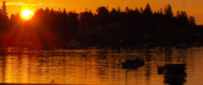
This image was taken at sunrise over a lake.

Here, the boats floating in the dawn lake become the focus of the photo.

The darker clouds were removed from this photo and the right side cropped to bring the sun into the center of the screen and allow for only the brightest of colors in the sky.

Zooming further to remove the water, now the bright clouds are the focus of the image.


In the next pair of photos, I have added borders to match the feel of the original image.  Unfortunately, the borders do not look the same after posting to this site for some reason.  Regardless, I had a lot of trouble with this activity because I knew what I wanted to do, but could not find proper software that could add fancy borders (a seemingly simple tool, I thought).


In the next pair of photos, I used colors already existing in the image to add words and background color.  I originally thought to use a vector-based graphics system to make it look fancy, but I then decided I liked the look of the background painted around the tree in the pixel-based software.  Both images are rather simple, and I think that reinforces the harmony that a simple tree represents.


Friday, July 13, 2012

Graphic Design, Part 2!

I engaged in two more graphic design projects.  In the first one, I used simple shapes to overlap each other to create my own shapes that may now be used for other projects, such as logos or aesthetic appeal.  This project comes from the Design Basics Index, page 131 ("Shape-Building Practice").  There was no particular shape I was trying to develop, so they all seem a bit random.  I had the most fun with circles, triangles, and stars.  I completed these objects in PowerPoint, as I needed vector-based program to create these images (as per the instructions).  The benefit of this is that I can resize these images however I like and not lose pixel resolution.  Also, I found it easiest to "group" the sub-images together so that I could reposition them on the page without distorting/altering them.


Next, I completed the "Word Portraits" exercise on page 241 of the Design Basics Index.  For this task, I chose a dozen fonts and picked words that I could easily associate with them, along with one word that seemed to be in contradiction to the font.  This was a worthwhile task because it required me to run through my list of available fonts; next time I need a particular font, I know just where to find it.  Interestingly, for some fonts I chose the font first and then decided what words would with it, but for others I thought of a word/emotion first and then attempted to find a matching font.  The latter is clearly the more feasible situation for conducting this exercise in a real-world scenario.  I used the "Snipping Tool" with Windows 7 to upload a screenshot of my MS Word document, so if the words are difficult to read, just click on the embedded image and a full size image will appear.  It would be nice if I could upload the original MS Word document to this blog as a file attachment; anyone know how to go about that?

Wednesday, July 4, 2012

Graphic Design

Before engaging in my own practice graphic design projects, I sought out a website with poor graphic design so that I would have an idea of what the fatal errors (or "sins") discussed by Golombisky & Hagen look like.  I didn't have to search long.  Most websites I visited had at least two no-no's somewhere on the site, but some were quite horrendous.  One such site is for Video Sonic, which specializes in video and audio equipment repair (although I did have to stare at their homepage for quite a while to figure that out, let alone what the same of their company even is).

Where to begin on this?  First, the company's name is so tiny in the corner that, like I said, I couldn't figure out who they were at all.  The next thing that jumps out at you is the enormous amount of negative space dead center in the screen.  I waited for a while thinking that the page just hadn't fully loaded.  If they're wondering what to put there, I would suggest to relocate their company name to that spot.  Next, the navigation is very sporadic (and some of those boxes aren't links at all).  The next "sin" is that they centered everything, which gives the page a horrible look.  Some things can be centered, but the navigation should be a list and there shouldn't be one credit card logo hanging out below the rest.  While we're on that, why is the credit card info smack between the links to their individual locations' websites? - And if you're now thinking that the individual websites look better than this simple portal, you're quite mistaken.  Next issue: they've decided to go with dark colors for the foreground and the background, which means you need to strain to see the words.  Of course those ugly white boxes randomly spewed on the page do assist slightly.  The one set of boxes that do pop out are their coupons, which they have decided to paint the brightest colors they could find, leaving the color scheme very unbalanced.  They also need to fix some of their links; if you click the chatroom, you'll be the only one there.  I could probably go on for a while, so I'll call it quits here.


Then I began some practice graphics of my own.  Both are activities from Krause's Design Basics Index.  The first is a Mini Compositions exercise which was relaxing to play around with.  Basically, each rectangle is supposed to include geometric shapes.  Some I used the computer to draw straight lines and others I free-drew (I'm sure you can't tell which ones I carefully drew without computer aid...).


The second activity was to develop three ads displaying a form of repetition in each.  Each ad has some good qualities, and I admit that I can see areas in each that can use improvement as well.  I won't bias you, though, so I'll let you comment on good/bad qualities at will.


Please leave comments on what you think about my first art since high school.  Like I stated above, there are pros and cons with each one; feel free to point out areas that are in need of improvement!